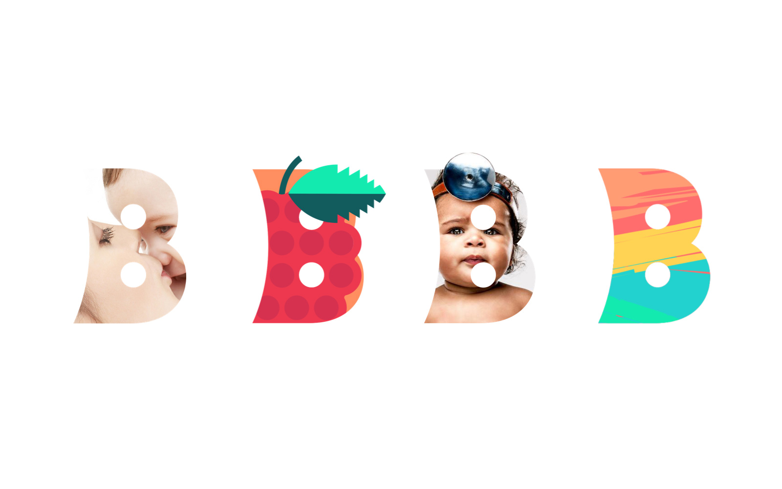
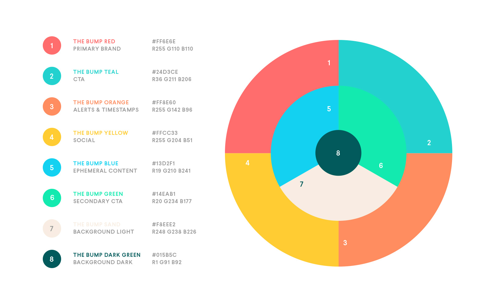
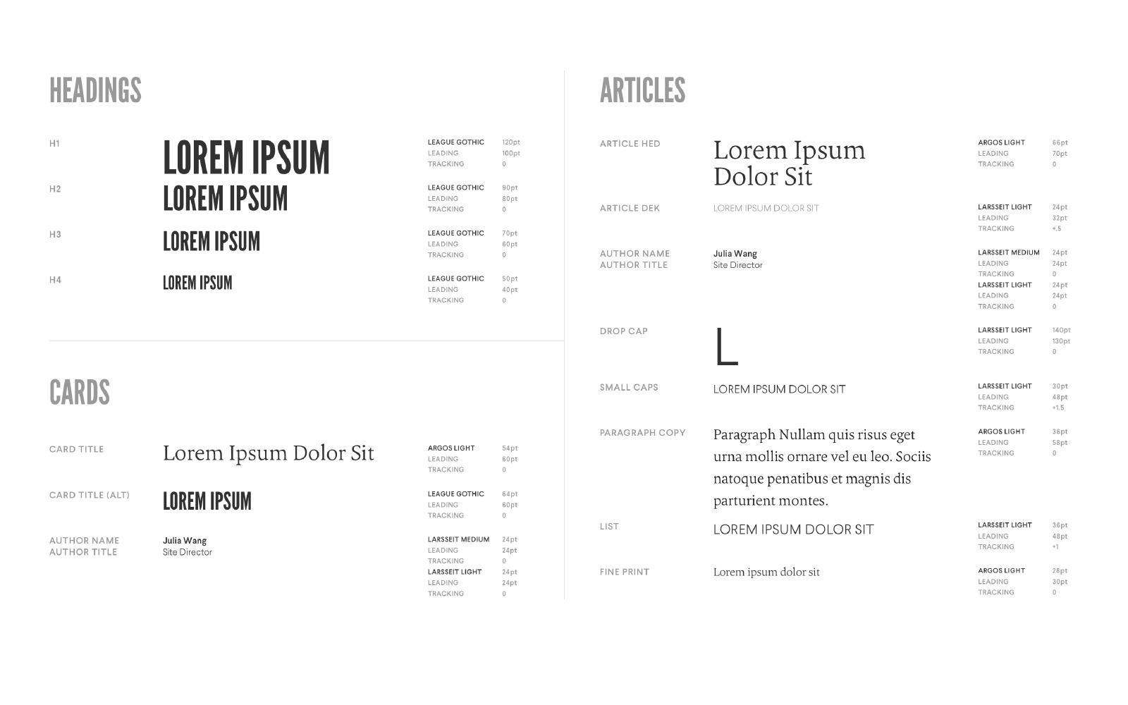
A dramatic shift in color and typography instantly announced the new branding as strong, friendly and fun for its users. The “B” mark was subtly utilized in a variety of ways, masking photography and illustration, or providing an end sign after article text. We developed a robust style guide, accommodating a variety of both desktop and mobile content and use cases.

We spent the better part of 2016 executing a top to bottom brand refresh for The Bump, a go-to internet resource for new parents and parents-to-be. Alongside their new identity, we crafted a detailed style guide to be executed across all platforms and content, with input from a quality internal team including Josh Himwich (VP, Product), Eben Levy (Experience Design Director), Julia Wang (Site Director), and Tracy Cho (Senior Marketing Strategist). Our efforts helped to transform The Bump into the fastest growing revenue (+300%) and user engagement driver (+150% weekly average users) for its parent company, XO Group.


Styleguide elements, “B” Mark
1 / 4
Styleguide elements, “B” as container
2 / 4
Styleguide elements, Color Values
3 / 4
Styleguide elements, Typography
4 / 4
For it’s popular How Big is Baby? feature, we commissioned illustrator Matthew Hollister to represent each week of a pregnancy as a fruit (this gets a lot more difficult toward the later weeks!). A lot of time and thought was spent on various mobile interactions and UX considerations, including new ways to customize the users Feed, and personalizing the Registry Genius section.
