Our first step was subtly updating the existing Breez logotype, and creating an accent mark for Royal Garden Society that could then live on any and all future product lines that were in development. The color palette naturally became clear based on the flavors of the product, and the Pantones had to be carefully selected as they appeared on tin packaging that would effect their brightness. We learned so much about the rules and regulations of the industry (and how constantly fluid they are), and adhered to strict packaging guidelines while developing an accessible and sort of “anti-luxury” feel that fit the brands existing customer base.
Art Direction
Branding
Design
Development
Packaging
In 2019, we were approached by Royal Garden Society to consider their established cannabis product line Breez as it approached a large scaling up in both product type and flavors for their mints and sprays. We expected a huge and fast-moving scope of work and put together an exciting team consisting of designers Claire Typaldos and Eliana Dominguez, as well as our frequent development collaborators Camp Quiet.
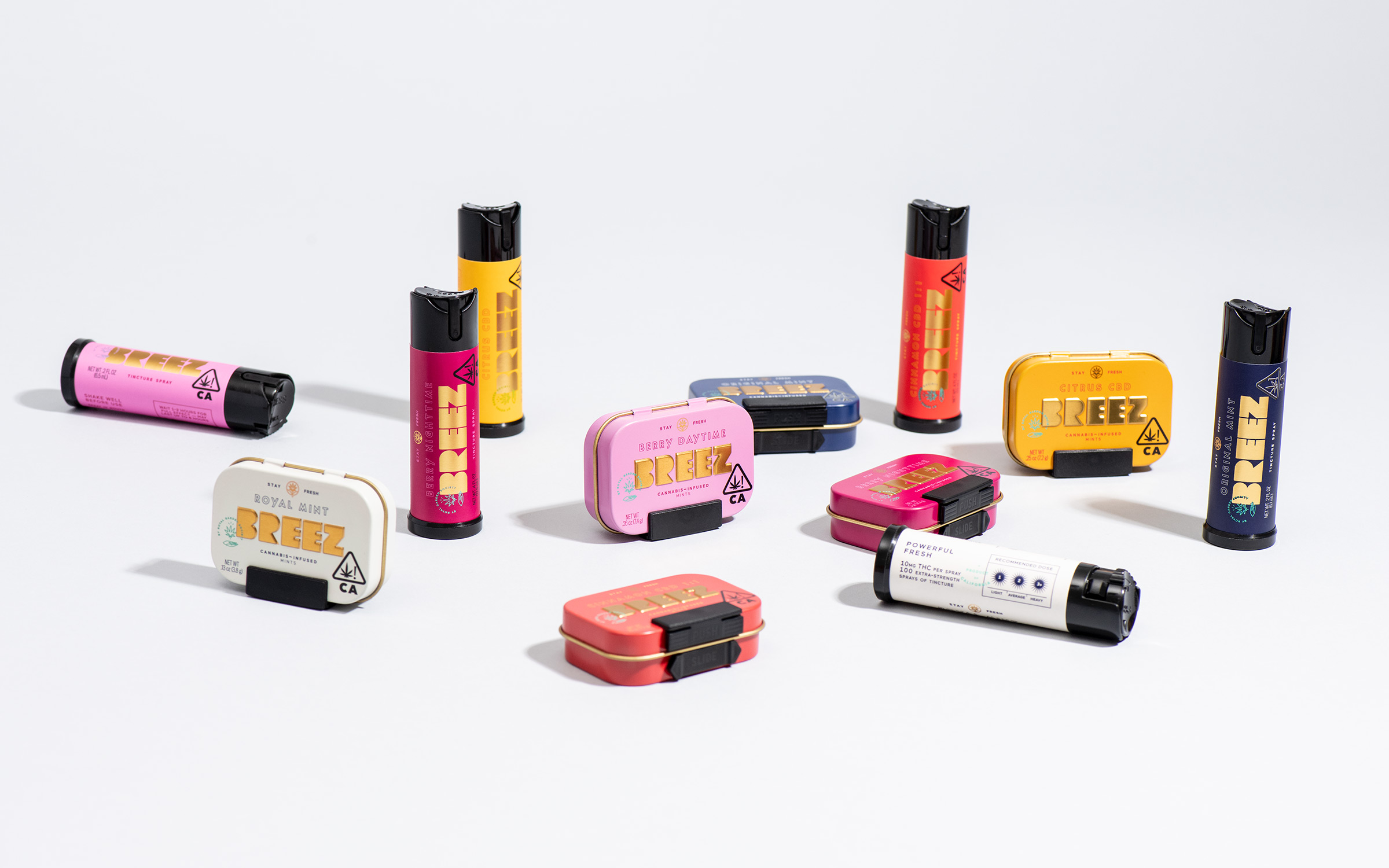
All photography by Julia Stotz


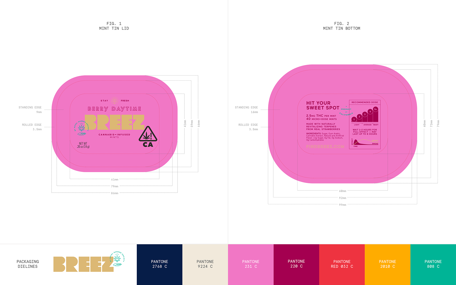
Mint Tin Packaging Dielines
1 / 5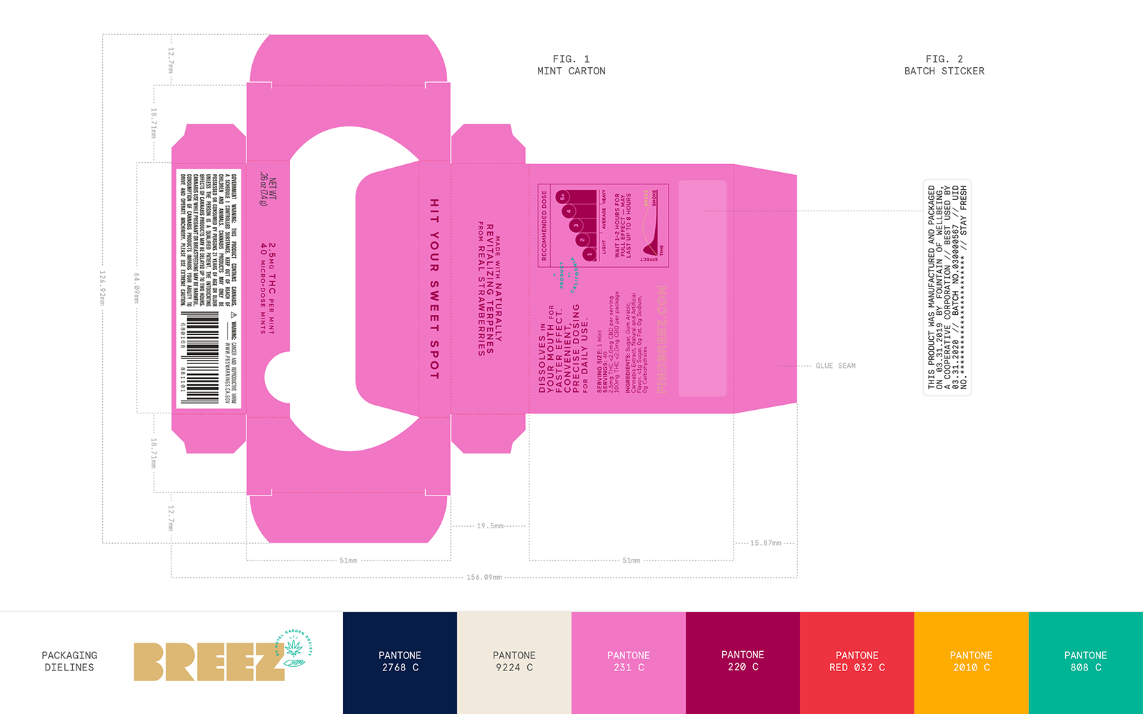
Mint Carton Packaging Dielines
2 / 5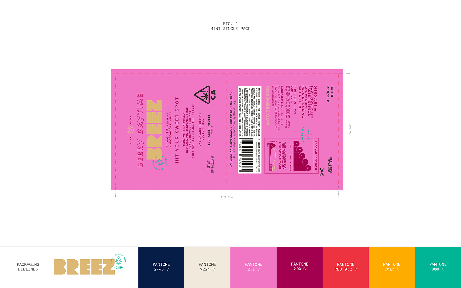
Mint Single Pack Packaging Dielines
3 / 5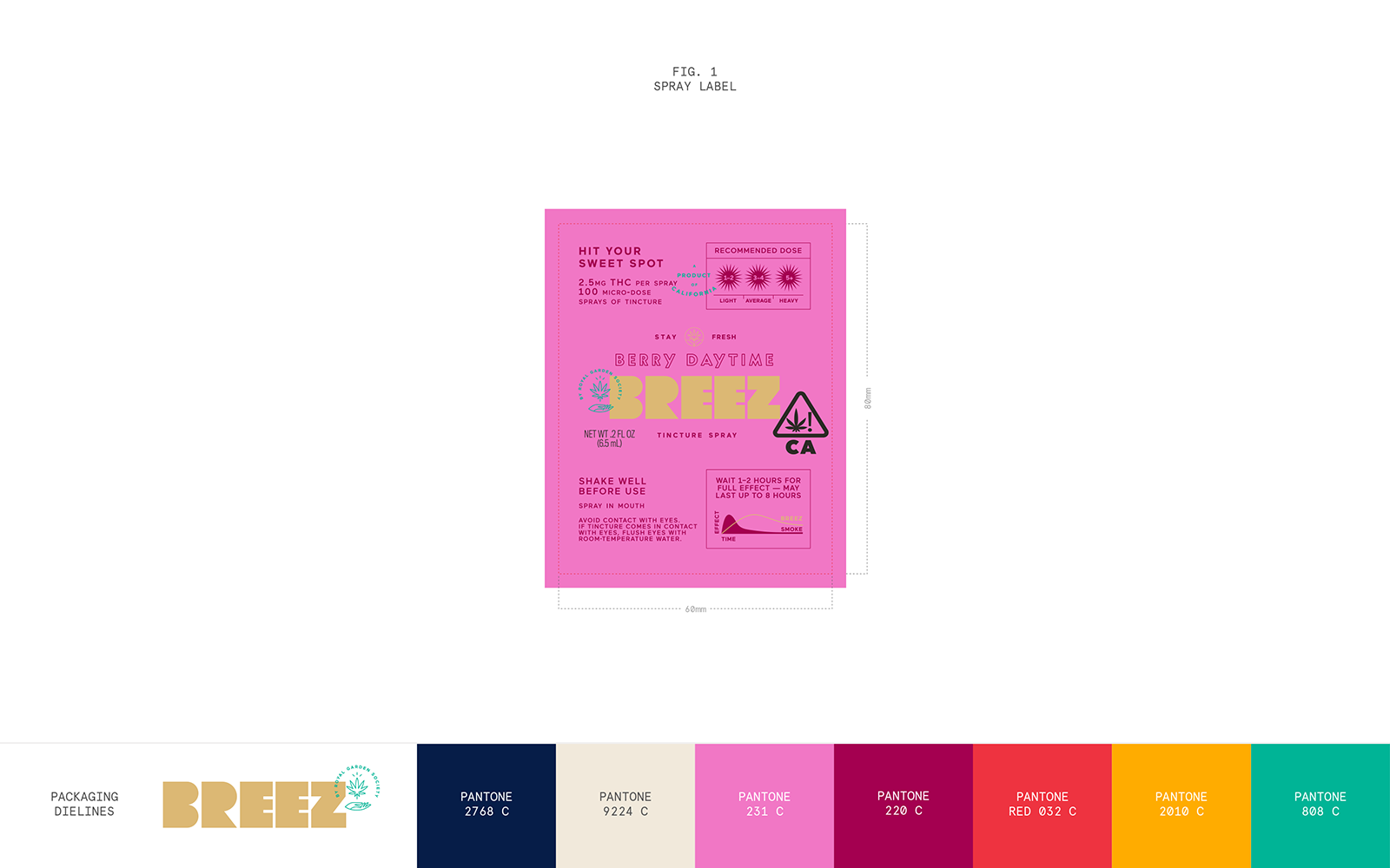
Spray Label Packaging Dielines
4 / 5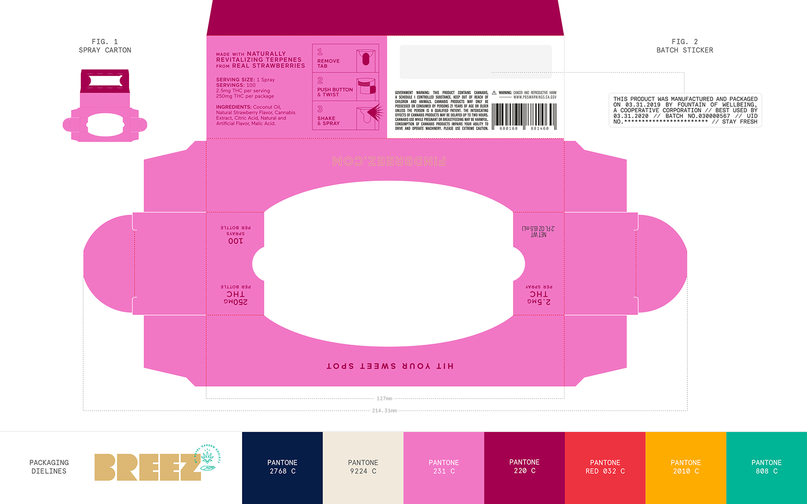
Spray Carton Packaging Dielines
5 / 5
We then brought on photographer Julia Stotz to introduce the new branding to the world, creating various scenes and instances for the different flavors and products, with prop styling by Natalie Shriver and talent from Star Touch Agency.

The website was built around the idea of being able to not only find the physical locations in your area that carry Breez, but finding the specific product for you based on its type, or flavor, or strength of dose.

