The Silvur mark abstracts the “u” in the name and represents growth over time — always forward and always upward. It is clear and concise, inspiring confidence and trust, while remaining familiar and conversational; we are working for “u”.

Art Direction
Branding
Design
Product Design
Silvur is a retirement platform designed to support Americans aged 50+ navigating modern retirement. Users receive a personalized Retirement Score that predicts how long their savings will last, as well as answer questions like: How long will my income last in retirement? How should I make smart choices for healthcare? Am I getting everything I can from Social Security? We were brought in during the beginning stages, establishing the brand and its guidelines, and building out the initial MVP app for launch.


The color palette is bold and bright, far from your traditional and more conservative financial institutions. We brought on designer Jonathan O’Brien to help expand the illustration style (and assist with the user experience later in the project), using straight lines and primary shapes whenever possible. A hint of the mark is always included as well. The mark can also be used as a graphic element, masking shapes, illustrations and even photography.
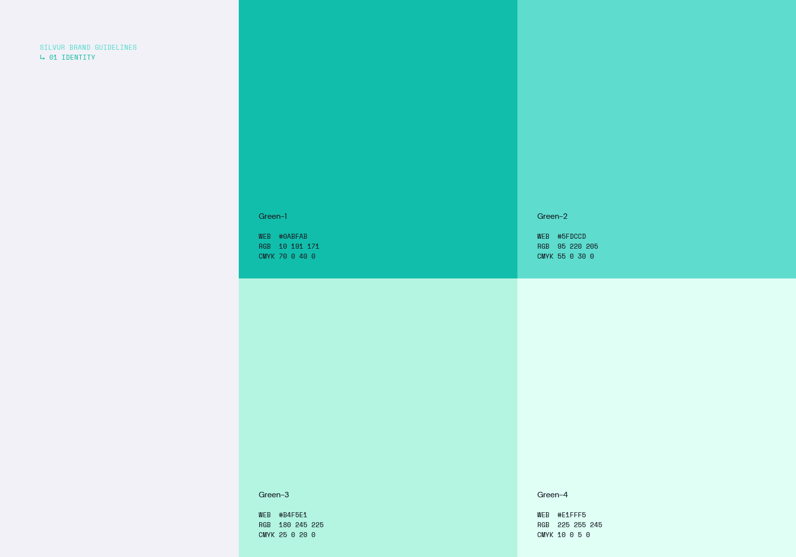
Primary Colors
1 / 6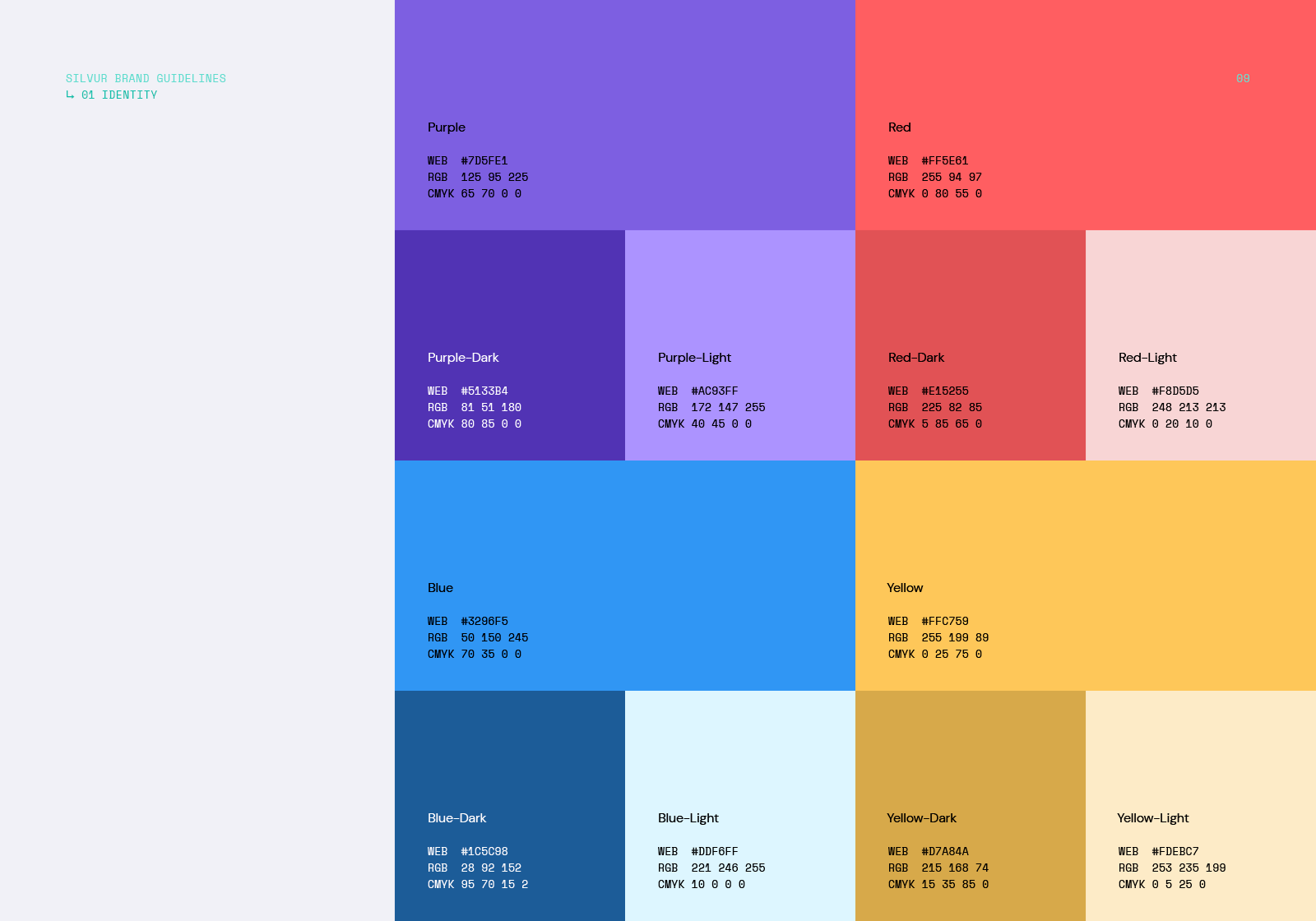
Secondary Colors
2 / 6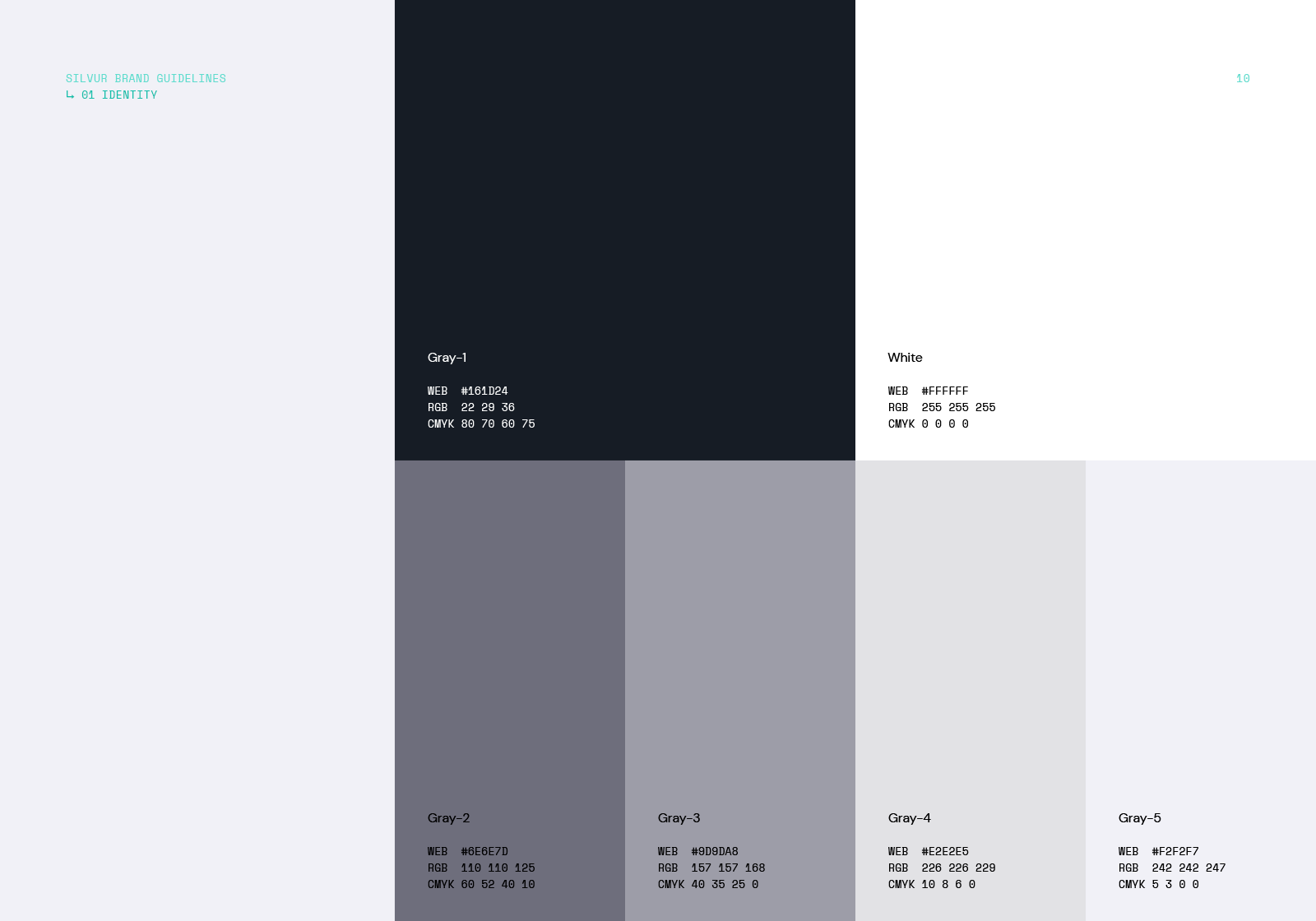
Grayscale Colors
3 / 6
Illustrations
4 / 6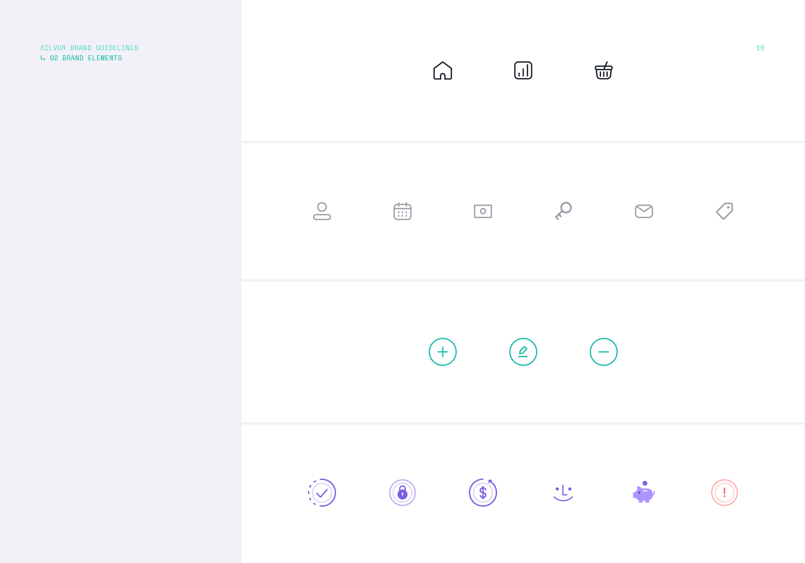
Iconography
5 / 6
Photography
6 / 6Everything came together for the app itself: large typography, friendly rounded shapes, easy to digest onboarding and data inputs. The Retirement Score relies on a large amount of necessary information being provided, so we wanted this experience to never feel overwhelming or repetitive.


